 Developer
Advanced Skinning guide
Introduction
This guide is intended for web developers, and assumes that you have previous experience of the aforementioned web technologies.
The graphical user interface of ReadSpeaker Enterprise Highlighting is built with standard web technologies, Hypertext Markup Language (HTML), Cascading Style Sheets (CSS) and JavaScript. Therefore, it is very simple to create a customized version of the player, for example to make it match your organization’s graphical profile.
Demo
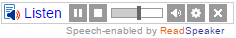
A demo is available in our Skin gallery
Skin Gallery
Implementation Instructions
Please note: in order for the service to work you need to include a reference to the ReadSpeaker.js-file
-
Download the skin
Before you begin you should download the following skin file:- Download the skin
- Unpack the ZIP-file that contains your skin files; a JavaScript, a CSS and an image.
- All necessary files can now be found in the folder named ReadSpeakerSampleSkin:
- ReadSpeakerSampleSkin.css – The style definitions for this sample skin.
- ReadSpeakerSampleSkin.js – The skin JavaScript file.
- ReadSpeakerSampleSkin.png – The CSS sprite image we will be using for this sample skin.
Please note that you can change the name of the files however it is important that they use the same name
-
Add references to your skin files
Add links to your skin files from the page/template where you want use ReadSpeaker. These references should go in the HEAD section of the HTML page.Example
<link rel="stylesheet" type="text/css" href="ReadSpeakerSampleSkin/ReadSpeakerSampleSkin.css" />
<script type="text/javascript" src="ReadSpeakerSampleSkin/ReadSpeakerSampleSkin.js"></script>
-
Change the listen button code
The listen button’s code contains several CSS classes. If you want to use a custom skin, you need to replace the class rsbtn with whatever name your skin uses as its base class. The base class for this skin is: rsbtn_sampleskin.Example (shortened):
<div id="readspeaker_button1" class="rsbtn rs_skip rs_preserve">
	<a accesskey="L" title="Title" href="...">
		<span class="rsbtn_left rsimg rspart">
		...
		</span>
	</a>
</div>
Should then be:
<div id="readspeaker_button1" class="rsbtn_sampleskin rs_skip rs_preserve">
	<a accesskey="L" title="Title" href="...">
		<span class="rsbtn_left rsimg rspart">
		...
		</span>
	</a>
</div>
Adaptation
The JavaScript file
We have only included the absolutely necessary data in the JavaScript file to keep it as small and readable as possible.
if (!window.rsConf) { window.rsConf = {}; }
if (!window.rsConf.ui) { window.rsConf.ui = {}; }
These two lines create the required objects, if they do not already exist.
window.rsConf.ui.rsbtnClass = 'rsbtn_sampleskin';
This line tells ReadSpeaker what the current skin is called, and which style definitions should be used.
window.rsConf.ui.player = [
	'<span class="rsbtn_box">',
		' <a href="javascript:void(0);" class="rsbtn_pause rsimg rspart rsbutton" title="Pause">',
			' <span class="rsbtn_btnlabel">Pause</span>',
		' </a>',
		' <a href="javascript:void(0);" class="rsbtn_stop rsimg rspart rsbutton" title="Stop">',
			' <span class="rsbtn_btnlabel">Stop</span>',
		' </a>',
		' <span class="rsbtn_progress_container rspart">',
			' <span class="rsbtn_progress_played"></span>',
		' </span>',
		' <a href="javascript:void(0);" class="rsbtn_volume rsimg rspart rsbutton" title="Volume">',
			' <span class="rsbtn_btnlabel">Volume</span>',
		' </a>',
		' <span class="rsbtn_volume_container">',
			' <span class="rsbtn_volume_slider"></span>',
		' </span>',
		' <a href="javascript:void(0);" class="rsbtn_settings rsimg rspart rsbutton" title="Settings">',
			' <span class="rsbtn_btnlabel">Settings</span>',
		' </a>',
		' <a href="javascript:void(0);" class="rsbtn_closer rsimg rspart rsbutton" title="Close player">',
			' <span class="rsbtn_btnlabel">Close</span>',
		' </a>',
		' <span class="rsdefloat"></span>',
	'</span>'
];
This is the markup for the player. It is a simplified version of the default player. The classes that are automatically assigned functionality by ReadSpeaker have been marked in bold.
In theory, you can omit any of the buttons as well as the outer slider containers from the markup. In practice, of course it does not make much sense to create a player without buttons. However, omitting certain buttons or the sliders might be a way to create a very easy-to-use player.
The order in which the buttons and sliders appear is not important. You can also add additional elements to the markup to achieve the structure you want.
Please note that if you want to use the sliders, all elements marked in bold must be included, not just the outer container. For the progress container this means that the markup must include both the .rsbtn_progress_container and the .rsbtn_progress_played elements.
In the sample skin we have omitted the rsConf.ui.popupbutton and rsConf.ui.popupplayer configuration settings. This means that we will use the default ones instead.
The CSS File
Let’s go through the CSS file section by section. Explanations and comments follow after each code block.
The container
.rsbtn_sampleskin {
	position: relative;
	font-family: Arial, Helvetica, sans-serif;
	font-size: 14px;
	line-height: 1.3em;
	float: left;
	border: 1px solid #ccc;
}
We start off by defining the layout of the div container that hosts the listen button as well as the player. The position directive makes sure that all child elements are positioned relative to this container. The border needs to be defined here to ensure it surrounds both the player and the listen button.
General classes
.rsbtn_sampleskin a, .rsbtn_sampleskin span {
	position: relative;
	display: block;
	text-decoration: none;
}
Here we tell the browser to treat a and span tags as block element, even though they are normally inline elements. The main difference between block and inline elements is that block elements occupy the entire width of their parent container, while inline elements can be placed on the same line. We prefer block style elements in the player because it is easier to control their position and dimensions.
.rsbtn_sampleskin .rsimg {
	background: transparent url(ReadSpeakerSampleSkin.png) no-repeat scroll 0 0;
}
We are going to use a CSS sprite for all bitmap graphics. With the definition above we make sure that all elements that have the rsimg class will use the sprite as a background image.
The sprite image looks like this (background color has been added for visibility):
Using the background-position directive we can select certain slices of the image by changing the offset. This example shows how the volume icon is selected by setting the vertical offset to – 70 pixels:
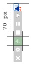
In the above example the position was defined: background-position: 0 -70px
.rsbtn_sampleskin .rspart {
	float: left;
	margin-left: 2px;
}
Since all span tags have been defined as block level elements they would normally occupy the entire width of the parent element. So in order to have them line up horizontally, we need to make them float. We use the class .rspart to control which elements should float.
.rsbtn_sampleskin .rsdefloat {
	clear: both;
}
This class is used to make sure that the elements that come after the floated elements start on a separate line.
.rsbtn_sampleskin .rspart.rsbutton {
	background-color: #999;
	width: 18px;
	height: 18px;
	-moz-transition: background-color .2s ease;
	-webkit-transition: background-color .2s ease;
	-o-transition: background-color .2s ease;
	transition: background-color .2s ease;
}
This class defines all buttons in our sample player. We want to make sure that they use the same dimensions and background color. The transitions are there to make the rollover effect a little smoother.
.rsbtn_sampleskin .rspart.rsbutton:hover {
	background-color: #aaa;
}
We add a very subtle color effect when the mouse pointer hovers the buttons. Thanks to the transition directives in the .rsbutton definition, this effect is appears animated.
.rsbtn_sampleskin .rspart.rsbutton:active {
	background-color: #888;
}
In the same way as above, using a pseudo selector (in this case :active), we create a color effect for when the buttons are pressed.
.rsbtn_sampleskin .rspart .rsbtn_btnlabel {
	display: none;
}
In our graphical player we do not want the text labels to be visible. However, by including them in the markup and hiding them with CSS we make sure that they are still accessible to text-based browsers and assistive technology.
.rsbtn_sampleskin .rsbtn_box {
	margin: 1px;
}
The .rsbtn_box element has been added to wrap all elements in the player so that we can add a margin between the elements and the containing element. The reason we use margin instead padding in the containing element is because we want to avoid problems caused by discrepancies between different box models.
Playback control
.rsbtn_sampleskin .rsbtn_play {
	float: left;
	margin: 1px 0;
}
.rsbtn_sampleskin .rsbtn_left .rsbtn_text {
	background: transparent url(ReadSpeakerSampleSkin.png) no-repeat scroll 0 0;
	padding-left: 20px;
}
This defines the listen button and the listen icon. Since this is part of the implementation code that sits in the actual webpage we choose to not add the .rsimg class, but instead we redefine the background image. Our recommendation is to not change the markup of the listen button part, to prevent potential problems with future updates.
.rsbtn_sampleskin .rsbtn_exp.rsimg.rspart {
	background: none;
	float: left;
	display: none;
}
.rsbtn_sampleskin.rsexpanded .rsbtn_exp.rsimg {
	display: block;
}
The .rsbtn_exp container holds all elements in the expanded player area. The .rsexpanded class is automatically added to the outer container when the player opens. We use this class to determine whether or not the expanded area should be visible.
.rsbtn_sampleskin .rsbtn_pause {
	background-position: 0 -34px;
}
.rsbtn_sampleskin.rspaused .rsbtn_pause,
.rsbtn_sampleskin.rsstopped .rsbtn_pause {
	background-position: 0 -16px;
}
This is the definition of the Play/Pause button (.rsbtn_pause). The first rule makes sure that the background image is correct. Then, we change the background image to display a play symbol when the player is in the paused (.rspaused) or stopped (.rsstopped) state, which we can see in the second rule. When the player is expanded, the play/pause toggle event will automatically be assigned to
.rsbtn_pause.
.rsbtn_sampleskin .rsbtn_stop {
	background-position: 0 -52px;
}
This is the stop button (.rsbtn_stop). We make sure that the background image is correctly positioned. ReadSpeaker will assign the stop event to this element.
Progress slider
.rsbtn_sampleskin .rsbtn_progress_container {
	border: 1px solid #999;
	width: 50px;
	height: 8px;
	margin-top: 4px;
	margin-left: 4px;
	background-image: none;
}
.rsbtn_sampleskin .rsbtn_progress_handle.rsimg {
	position: absolute;
	background-color: #666;
	top: -3px;
	left: -2px;
	width: 4px;
	height: 14px;
	background-image: none;
}
.rsbtn_sampleskin .rsbtn_progress_played {
	position: absolute;
	height: 100%;
	background-color: #ccc;
	background-image: none;
}
The progress slider consists of four elements:
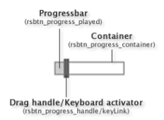
The container, .rsbtn_progress_container. This is typically the area to which the drag handle is constrained.
The drag handle, .rsbtn_progress_handle. This is a draggable handle that can be used to skip to different parts of the audio file. The drag handle’s CSS-class can be changed using the JavaScript skin file:
window.rsConf.ui.progressHandleClass = ‘AClassName’;
The keyboard activator, .keyLink. This is an anchor tag which is used for activating the drag handle via the keyboard. It is usually not visible.
The progressbar, .rsbtn_progress_played. This element can be used to visualize the current progress. Its width (expressed in percent) will be automatically updated every 500 milliseconds to reflect the current position in the audio stream.
Note! Both the drag handle and the progressbar need to be positioned absolutely in order for them to work.
When the drag handle (.rsbtn_progress_handle) is controlled by the keyboard, an additional class, .rskeycontrolled will be added to it. You can redefine this class in order to change the appearance of the drag handle to indicate that it is currently keyboard-controlled.
In the same way, the class .dragged will be added to the drag handle when it is being dragged, either with the mouse or the keyboard.
Volume
.rsbtn_sampleskin .rsbtn_volume {
	margin-left: 4px;
	background-position: 0 -70px;
}
We set the volume button’s background position and add a little margin to make it symmetrical to the other buttons. Clicking this element will toggle the visibility of the volume slider container.
Volume slider
.rsbtn_sampleskin .rsbtn_volume_container {
	position: absolute;
	display: none;
	top: 100%;
	width: 16px;
	height: 40px;
	border: 1px solid #999;
	background: #fff;
}
.rsbtn_sampleskin .rsbtn_volume_slider {
	width: 6px;
	height: 30px;
	margin: 5px;
	background: #ccc;
}
.rsbtn_sampleskin .rsbtn_volume_handle.rsimg {
	position: absolute;
	top: -2px;
	left: -3px;
	width: 12px;
	height: 4px;
	background: #666;
}
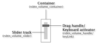
The volume slider’s structure is similar to that of the progress slider, although the volume slider renders vertically by default. You need to take the direction into consideration when defining the volume slider’s styles.
You can change the direction of the volume slider in the skin JavaScript file:
window.rsConf.ui.volumeDir = ‘v|h’;
‘v’ for vertical and ‘h’ for horizontal.
We hide the container, because it will be made visible when the user clicks the volume button.
We give the drag handle negative top and left values because we want the center of the handle to start at the top of the slider track. The ReadSpeaker user interface controller will take this into account when rendering the slider component.
Note: Just like for the progress slider the drag handle must be positioned absolutely in order to work.
The .rskeycontrolled and .dragged classes will be added to the drag handle (.rsbtn_volume_handle) in the same way as for the progress slider. See the Progress Slider section for more information about this.
Settings Button
.rsbtn_sampleskin .rsbtn_settings {
	background-position: 0 -88px;
}
This button opens the settings dialog. All we do in the CSS is to change the background position so that the right icon is displayed.
Download Button
In this sample skin we have chosen to not include the download button. If you want to include it in your skin, you can define it using this selector:
.rsbtn_sampleskin .rsbtn_dl.rsimg { … }
Close Button
.rsbtn_sampleskin .rsbtn_closer {
	margin-left: 4px;
	background-position: 0 -106px;
}
We add a little extra left margin and set the background position. The close player event will be automatically assigned to this element.
.rsbtn_sampleskin.rspopup {
	position: absolute;
	background: #fff;
	border: 1px solid #555;
	box-shadow: 0 0 5px #777;
	display: none;
}
Finally, we add a rule that controls the popup button/popup player. The position statement is important in order to not disturb the document flow when the popup button is displayed. The box shadow is there to make the popup stand out from the rest of the page and make it more visible.